Jumpspeak
Bringing Jumpspeak's new product identity to the web. A redesigned landing page, a reusable Webflow design system and a consistent experience across five languages.
[ 01 ]
Brief
The product had evolved. The website needed to catch up.
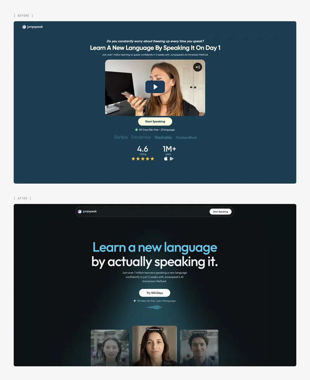
Jumpspeak's app had adopted a new visual identity: dark surfaces, vivid blue accents and an interface built around real conversations. Its landing page still reflected an earlier version of the product.
For visitors arriving from paid campaigns, that page is a key step before the signup quiz. It needed to introduce the experience they were about to use and work across multiple markets.
Jumpspeak had already tested the content and structure, giving us a proven starting point. Our task was to bring the app's identity and interactions into that experience, then build the Webflow foundation to support new pages and languages.
[ 02 ]
Solution
A website that feels like the product
We used the app's design system to shape the new visual direction. Dark surfaces, blue accents, Outfit typography and conversation UI connect the landing page to the experience inside the app.
The existing content and page structure stayed at the core. Around them, we redesigned the presentation, giving product demonstrations and learner stories a stronger role.
The experience, brought to life
Video persona cards introduce visitors to conversations in the language they want to learn. Interactive demos show how scenarios, audio practice and face-to-face conversations work. A tabbed carousel connects those features to everyday situations: work, travel, dating and friendships.
These details make the offer tangible. Visitors can see what practicing with Jumpspeak looks like before entering the signup flow.
A clear path to signup
The page keeps its focus on the next step. Social proof appears alongside the opening message, while calls to action throughout the page repeat the core reassurance: 100 days risk-free, with 23 languages available.
A two-row review marquee brings together feedback from the App Store and Google Play. The comparison table gives Jumpspeak's features a clear visual emphasis, helping visitors evaluate the offer as they move toward signup.
A foundation the team can build on
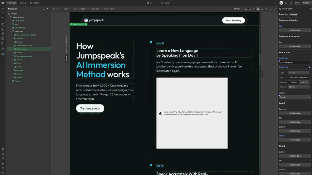
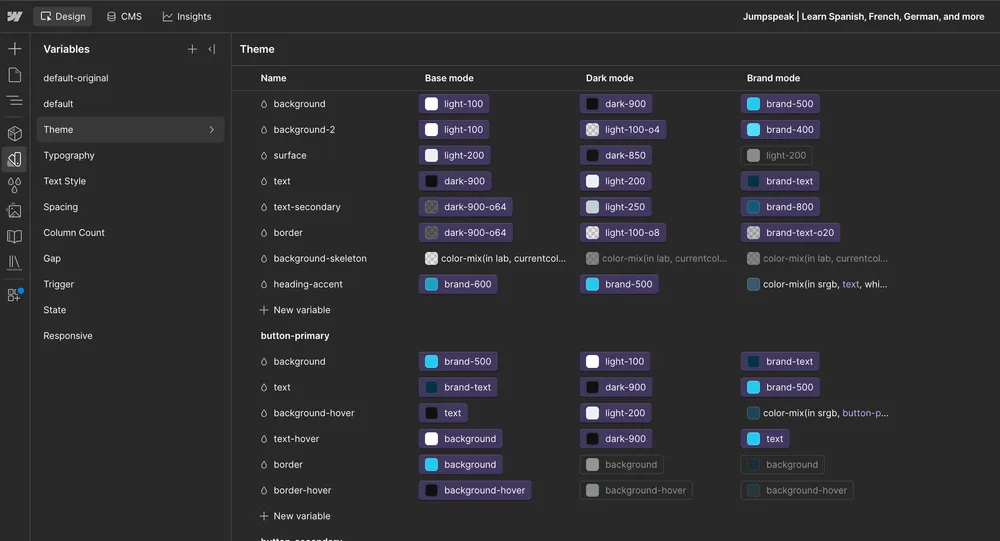
The existing Webflow project lacked a shared system for building new pages. We introduced a Lumos-based foundation within Jumpspeak's own project, with reusable variables for color, typography and spacing.
Section themes keep visual treatments consistent. A component library covers heroes, product demos, testimonials, comparison tables, FAQs, calls to action and the footer.
Each component has organized, documented properties for editing copy, media and links. The team can adapt pages through those controls while keeping the underlying design consistent.
Five languages, one shared system
We built the localized experience with native Webflow Localization, giving each language its own subdirectory while keeping layouts and components shared.
The homepage and English practice page use the same hero component, with configurable videos, captions and badges. On English practice pages, example phrases remain in English while explanations, corrections and interface labels adapt to the learner's language.
We also consolidated old campaign pages and added redirects to their localized equivalents. Future languages can build on the same foundation.
Motion that doesn't slow the page
Video, animated interfaces and looping reviews are central to the experience, and pages this media-heavy usually pay for it in load time. This one doesn't: assets load as they come into view, so the page opens fast and the motion arrives as visitors scroll.
[ 03 ]
Result
Jumpspeak's acquisition pages now reflect the product visitors are about to use, across five languages.
Behind the redesign is a shared Webflow foundation: reusable components, consistent styles and a localization setup the team can extend. New pages have an established starting point, making it easier to carry the same design quality into future campaigns and markets.
Next case · 10
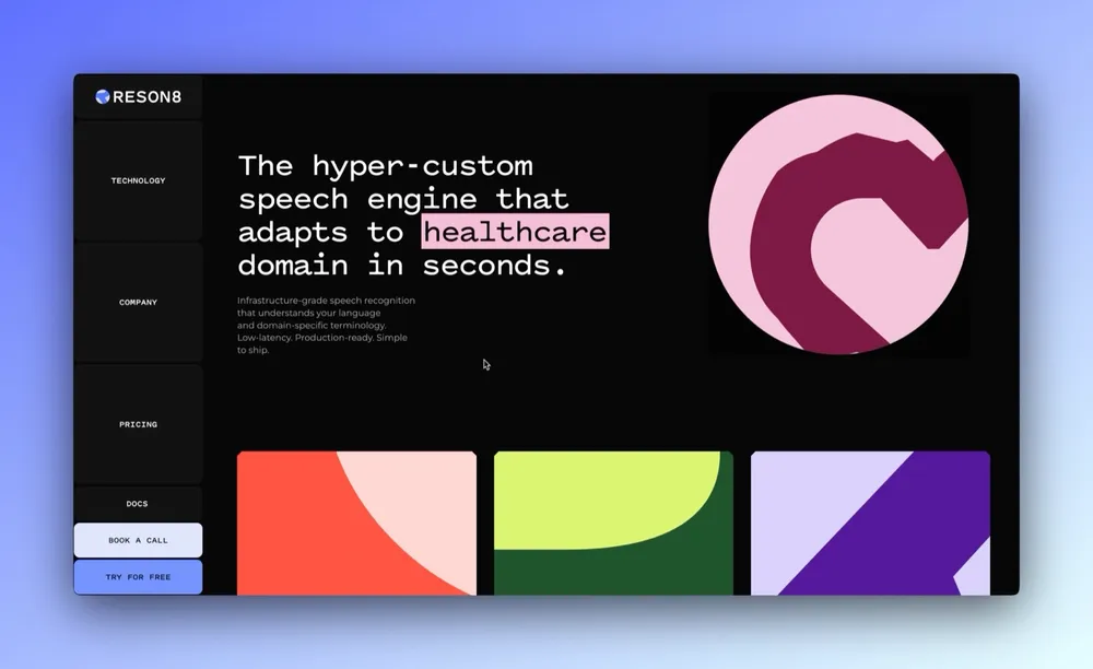
Reson8
Webflow development for a speech recognition platform, with an industry-switching hero, a custom media slider, and a physics-driven closing section.